Hi. I'm a NYC-based, multidisciplinary Lead UX Designer!


Hello! I'm a multidisciplinary, NYC-based Lead UX Designer with expertise in consumer banking, investment banking, and wealth management. I enjoy uncovering user insights, creating delightful experiences, solving complex, data-dense problems, and helping "difficult" teams work together.

View Resume    joshua.rasiel@gmail.com    917.755.2612

JPMorgan: Realtime Risk Monitor

Lead UX
User Interviews & Testing
Ideation & Strategy
Navigation/IA
Wireframing
Interaction/UI Design

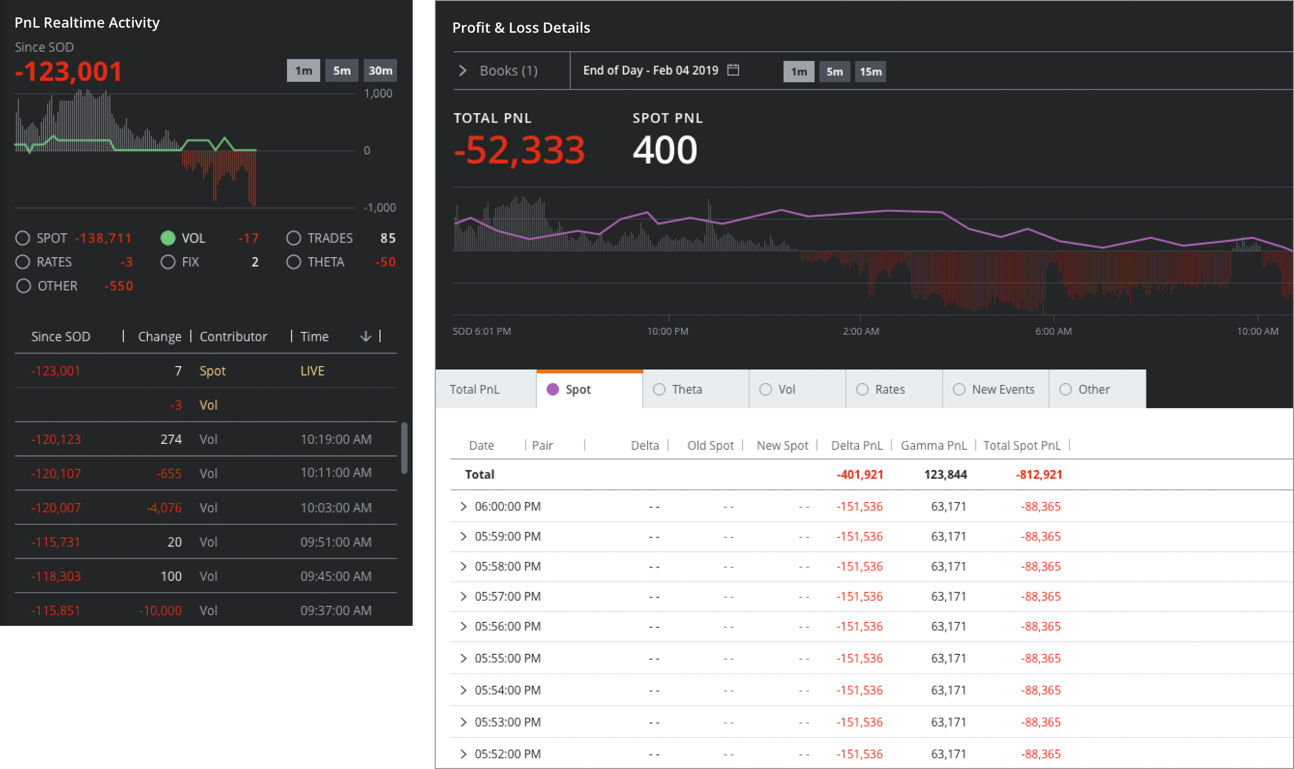
Investment bankers must continuously watch and hedge their positions against market risk. At JPMorgan, this is done with very sophisticated, very ugly risk management tools.

The bank had decided to offer subscriber access to the underlying market data. This would let external clients run the same powerful risk analytics used by our own traders. But these tools had never been designed for clients. They weren't user friendly, efficient, or delightful. To make this into a sellable product, we'd need to start from scratch.

Our job, working with a large team of devs and quants, was to completely reshape these tools into a cohesive, streamlined, user-friendly, visually attractive product. It would be a massive, multi-year undertaking, with many obstacles. Eventually, it would be a pretty huge win for our team. But first, we would spend countless hours talking to clients, learning how their derivatives hedging use cases were totally different from ours. We'd also have to learn what a "derivative" was. I was an art major, by the way. And now I can explain options greeks to you, in detail.

Here's the JPMorgan landing page for this product, with a bit more info.

To learn more about the role I played, please drop me a line.

Citigold: Portfolio Review

Stakeholder Workshops
Ideation
Wireframing
Information Architecture
Interaction/UI Design

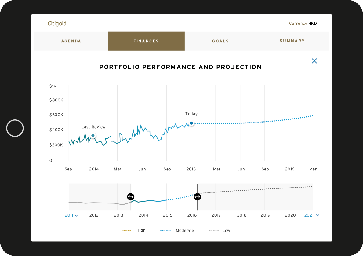
Citigold is Citibank's premium wealth management service. A key part of that is the portfolio review, which was supposed to be a signature experience and an important customer touchpoint. It fell short for a variety of reasons.

Our task: make it into a remarkable experience, driven by this tablet app.

More from this project:

2.4Mb PDF file

Hum by Verizon: Location and Navigation

User Interviews
User Flows
Wireframing
Interaction/UI Design

Hum is a cool Verizon product that turns any car into a smart car. You just plug in a little sensor (it goes under the steering wheel on any car made after 1997) and you have onboard diagnostics, vehicle tracking, safety alerts and more.

This was V2 of this product. We helped to add several new features - such as navigation and driver safety score - but more importantly, we dramatically improved the UX and UI. After our update, the iOS App Store rating went from 2.5 to 4.5 stars!

We also did in-store customer interviews, which is how I learned that parents are absolutely terrified of their teenagers behind a wheel. They loved that with this product, they could track them.

Here's a fun commercial showing off the parking locator feature.

JPMorgan: Markets Content Hub

Lead UX
User Interviews & Testing
Ideation
Wireframing
Navigation/IA

At JPMorgan, "Markets Content" is a form of daily commentary and trade ideas, provided by salespeople to clients as a value-add. It's typically distributed via email.

A lot of this content would simply disappear in client inboxes. It was also impossible to track the effectiveness of the content, share or suggest authors, or discover content outside your direct relationships.

Our job was to design a content hub that addressed these concerns. The challenge was that email had to remain as a core flow, because salespeople relied on the informal, newsletter feel of emails to strengthen their customer relationships.

Our solution was to create the hub alongside an Outlook plugin - which we also designed - that would CC the email as an upload to the content hub. Users of this cleverly named "Markets Content Hub" could then finally enjoy all the content discovery and sharing features that are customary in this century.

Citibank.com: 2016 Redesign

Navigation & Information Architecture
Content Strategy
Wireframing
Interaction Design
Prototyping

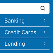
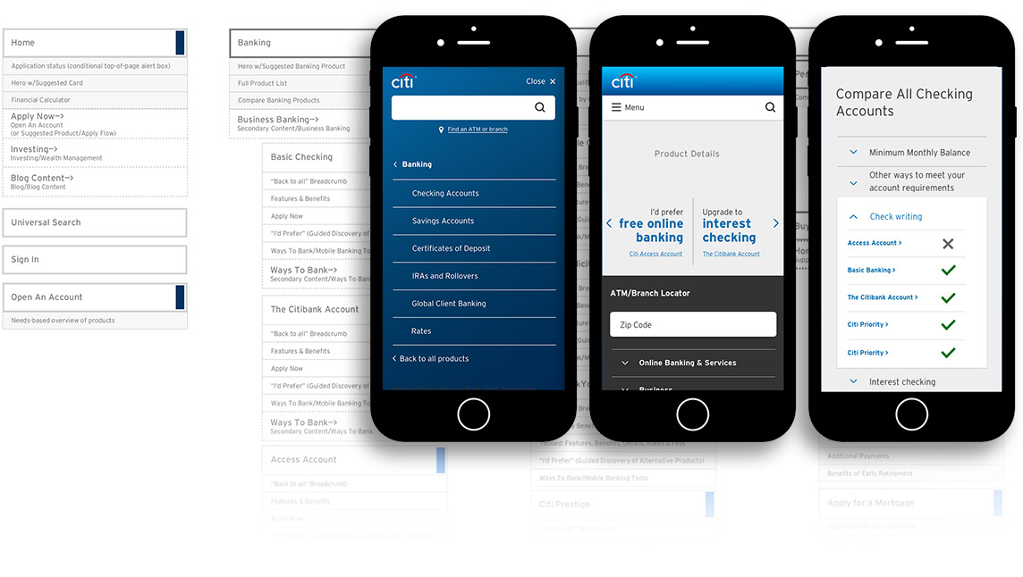
Visiting Citibank.com had become a complex and overwhelming experience to users. The navigation was inconsistent from page to page, the IA was confusing, and the UI was outdated.

My team's task: a complete redesign of Citibank.com. Entirely new navigation and IA, an updated, mobile-first UI, and vastly simplified content. It took us one year, working onsite with the client, and included extensive customer research and testing.

I'm proud to say that the work we did is now live on Citibank.com. You can learn more about the integral role I played by clicking the PDF below.

More from this project:

2.6Mb PDF file

Time Warner Cable: Responsive & Flat Design Overhaul

UI & Visual Design
Content Strategty
Wireframing

TWC commisioned this as a proof of concept, an early stage in a much greater project:the complete overhaul of their website. My role was the visual redesign of timewarnercable.com, with a focus on flat design. Basically, I made everything flatter, cleaner, simpler, and brighter.

I also tweaked some copy, in keeping with the core concept of flat design - clear, simple, bold messaging. For example, the two hero banners here were originally one hero banner. By breaking them into separate messages, I was able to show how they could be more impactful.

This was part of a larger project that involved transitioning to a fully responsive site, so I designed for multiple breakpoints. You can open the PDF below to see more of these pages and states.

More from this project:

1.9Mb PDF file

MyRichUncle Student Loans: "Checklist" Ad

Concept
Art Direction
Copy

This ad changed laws.

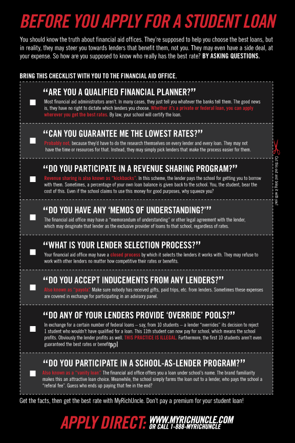
MyRichUncle was competing against much larger lenders, in a corrupt industry. We had better rates, but there were all these sneaky ways the schools and lenders could conspire to screw the students. Some of them were illegal. But we couldn’t just say, “Sallie Mae bribed your school!” It was complicated and technical.

My challenge was to read and understand a ton of flibbidybibbidy financial jargon, then translate it into normal people words, in an ad that everybody would notice and understand, but nobody could sue us over.

We came up with this “Checklist” concept, which was also sneaky. We’re not SAYING any of these claims are true, we’re just not saying they’re NOT true, you know? Then we put it a two-page spread in every national newspaper.

This and others we made were credited with helping to bring national attention to the issue. The NY Attorney General took notice, and launched an investigation. That lead to new state and federal laws, aimed at reforming the student loan industry. Those laws are still in place. Also, I like this piece because it got hate mail from banks.

Can't read puny graphic? HULK SMASHes open the PDF below!

More from this project:

237Kb PDF file

JPMorgan: Order Entry Ticket Revamp

Lead UX
User Testing
Interaction Design
Design Systems
Prototyping

For this relatively straightforward project, I was asked to update one of the order entry tickets used on the trading floor. Specifically, it needed to align to the our UI toolkit in both appearance and function.

The big challenge here was making sure the traders liked it. In particular, were the Buy/Sell tickets different enough, and was it obvious how to switch betweem them? I tested a few versions on the floor, and for this version, the answer was yes to both.